Production: The Desktop Publishing Revolution, 1994–2001
Subscribe
https://meridian-archive.com/feed.xmlOpen in your app, or paste the link above into any other:
A Title Meant to Expire
When a magazine’s production floor let a union paste-up compositor go between roughly 1992 and 1995, it did not always call the change a firing, and it did not need to: three outcomes covered the transition industry-wide, and a shop moved among them as a matter of routine. A compositor took a package buyout and left outright. A compositor was simply let go. Or a compositor was reassigned to a title — “production coordinator” — that carried no defined duties, appeared on the masthead or the org chart as though it were a real job, and that everyone on the floor understood, without the understanding ever being written down, to last one or two production cycles before the job ended anyway. The title changed nothing about the outcome. It only changed what the ending was called while it was still happening, and how long the calling took. The compositors who received it were, almost without exception, men in their fifties, often Italian or Irish, who carried X-Acto scars on their left index fingers and the rubber-cement smell of Bestine in the creases of their palms — men who had spent careers learning to burnish a page to register with a rubber roller and were not, as a rule, retrained.
The mechanism that made a production coordinator’s title obsolete before it was printed sat on the same floor. A magazine’s typesetter in the mid-1980s owned a fixed catalogue of typefaces, held on photographic filmstrips or disks proprietary to its phototypesetting machine; changing a page’s type meant a call to an outside vendor, a wait of a day or more, an invoice. By the middle of the following decade, a designer made the same change at a desk, in the time it took to open a font menu — and the same authority that let a designer swap a typeface without a vendor’s involvement let an art director build a finished page directly, without the paste-up artist whose hands had once been required to make it real. In a 1994 issue of the Santa Monica magazine Ray Gun, an interview with the musician Bryan Ferry ran across two pages set entirely in Zapf Dingbats — a symbol font, in which every letter of the transcript became a bullet, a snowflake, a pair of scissors, a solid black star; a legible version ran later in the same issue, in a different typeface, for a reader who wanted the actual words. David Carson, the magazine’s art director, said afterward that he had found the transcript boring and had set it in Dingbats rather than run it as prose — a private decision that no compositor, no vendor, and no production coordinator was in the room to countermand. The gesture became, within design circles, the signature example of what critics and admirers alike came to call grunge typography — layered, distressed, deliberately resistant to the grid.1 It was not a private taste. At a Print magazine panel on typography reported in 1991, the modernist designer Massimo Vignelli, co-founder of the firm behind the New York subway’s signage and the American Airlines identity, called the new aesthetic’s leading outlet, the design magazine Emigre, “garbage” and “an aberration of culture”; the remark set off a running argument, carried through design publications for most of the decade, over whether the same software that let a designer draw anything at all obligated a designer to draw something legible.2 Vignelli did not soften the position later: designers working in Carson’s vein were, in his words, a “wasted generation,” against everything and for nothing in particular.2 Vignelli’s own reputation rested on decades of discipline exercised through physical constraint — a limited set of typefaces, a fixed grid, decisions that had to be right the first time because a corrected mechanical was expensive to redo. The machine that let Carson set an interview in Dingbats was the identical machine that let a Quark user revert a bad decision in seconds; it removed the cost of being wrong as thoroughly as it removed the cost of being illegible, and it removed the compositor’s hands from the process along with both costs.
The tool on Carson’s desk had a business history. Adobe Systems released Illustrator, a vector-drawing program built on the same PostScript language that ran the company’s laser printers, in early 1987; a revised version sold in 1988 as “Illustrator 88” added pen-tool precision that let a designer draw a typeface’s own curves rather than only place a typeface someone else had cut.3 Quark, a small Denver software house founded in 1981 by a programmer named Tim Gill on a $2,000 loan from his parents, shipped the first version of its page-layout program the same year as Illustrator.4 Its third major release, in 1990, made QuarkXPress the standard machine of American magazine production for most of the decade that followed.5 Fred Ebrahimi, installed as Quark’s chief executive in 1986, ran the company through that dominance and, in 1999, watched Gill sell his stake in it for a reported $500 million.4 Between Illustrator and QuarkXPress, the graphic side of a magazine’s production floor got roughly what the Linotronic imagesetter had already given its type: control moved from a vendor’s shop, and from the paste-up table, to a designer’s own screen.
The Software on the Floor
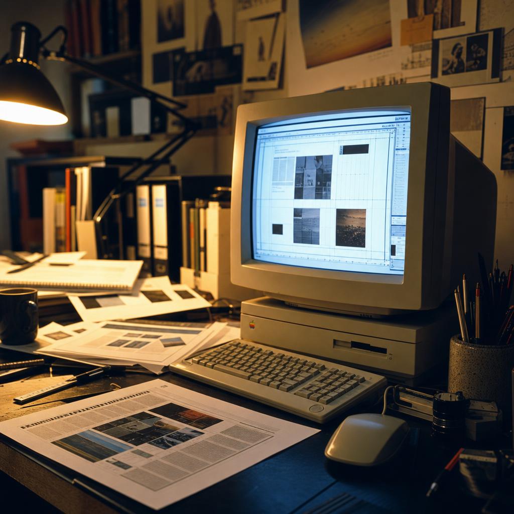
An art department in the early 1990s still ran on a workshop’s materials: rubber cement, spray-mount adhesive, the ozone tang of a stat camera’s arc lamp, marker fumes from a comping table where an illustrator blocked out a chart or an opening spread by hand before it went to production. The Macintosh that displaced these tools produced no smell of its own, at first, and then it did. A design workstation’s monitor — a Mac’s own display, or one of the aftermarket screens sold by companies like Radius — ran warm for hours at a stretch, its plastic housing radiating a low, steady heat that a designer resting a hand near the back panel could feel: faintly electrical, nothing like the honeyed warmth of a wax pot down the hall. What replaced spray adhesive as the room’s ambient sensation was not quite a smell. It was a temperature: warm plastic, a faint metallic note off a cooling fan, the machine itself working audibly through the afternoon.
Quark and Illustrator changed a designer’s posture more than a designer’s furniture. A designer who had spent a decade at a comping table, marker in hand, roughing out a chart’s proportions before handing the sketch to a mechanical artist for finished rendering, now sat at a keyboard and mouse and drew the same chart directly in Illustrator, using a pen tool that plotted mathematically exact curves rather than hand-drawn ones and could be revised afterward without erasing anything. The redrawing was faster, and within a few years cheaper, than the mechanical artists and outside illustrators it replaced for routine work: a bar chart, a decorative initial, a magazine’s recurring department icon. What had been commissioned piecework, billed by the job, became a file a junior designer produced between other tasks, built from a library of fonts and clip art that arrived bundled with the software rather than assembled job by job from outside vendors.
The authority inside the art department shifted with the tool. An art director who had once sketched an idea on paper and described it to a mechanical artist for execution could now build the finished page directly, without an intermediary who might interpret the sketch differently than intended. What had been a conversation between two people with two different skills became, on many magazines, one person’s uninterrupted decision — faster to execute, harder to argue with, since there was no longer a second craftsperson in the loop whose objection might be heard before a page closed. The junior staff who benefited from this compression were not, typically, the same junior staff who had spent years learning to operate a stat camera or trim a mechanical to register; a design department reorganized around the screen rewarded whoever had learned the screen first; seniority measured in years at a drafting table stopped translating directly into seniority measured in comfort with a mouse and a menu bar.
Who Got to Keep Working
The consequence fell first on people who had never been on staff at all. Magazine art departments had long supplemented in-house design with freelance illustrators — a spot drawing for the back of the book, a decorative border, a full-page image for a personal essay — paid by the assignment, at rates that had risen through the 1970s and 1980s roughly in step with the rest of editorial freelance work. Through the 1990s those rates stopped moving: an illustrator entering the field in the middle of the decade was, by most published accounts, paid at rates a working illustrator recognized from ten years earlier, even as the cost of everything else in New York had not stood still.6 The change was not simply less work for illustrators; it was a different kind of work. A designer facing a tighter production schedule, having absorbed the typesetting duties a vendor once handled, increasingly found it faster to license an existing image — “stock” illustration, sold and resold — than to commission a new one; for an illustrator with a back catalogue this was a mixed result, modest resale income from art already made against a shrinking number of assignments to make anything new.6
This was a different population from the union compositors whose paste-up floor had already begun emptying by the early 1990s. Compositors had been staff, organized, and covered, however imperfectly, by severance when their jobs ended. Illustrators working the back-of-book freelance market had no roster to be cut from and no package to be offered; a magazine simply stopped calling, and the falloff registered nowhere but in an individual’s own invoices. Staff designers and mechanical artists inside art departments felt a milder version of the same pressure: a skill built on drafting-table precision — hand-lettering, mechanical paste-up of charts and maps, careful knife work on a comp — no longer had an obvious place on the org chart once those same tasks moved to a screen. Some retrained. Studios facing the transition more often solved it the way hiring problems usually get solved, by recruiting from the pool of art-school graduates who already knew the software rather than retraining designers who did not.6
The ambivalence had been named before the shift was complete. In 1989, the design magazine Emigre devoted its eleventh issue to a set of interviews with graphic designers about the Macintosh, under a title its editors judged sufficient at two words: “Ambition/Fear.”7 The issue’s own framing captured both halves at once: “visions of bold-italic-outline-shadow Helvetica ‘Mac’ tricks,” it noted, “have sent many graphic designers running back to their T-squares and rubber cement,” even as the same machine let a designer “control all aspects of production and design, no longer requiring an outside typesetter or color separator.” The fear had a practical edge as well as an aesthetic one: some illustrators interviewed for the issue said they had started delivering finished work to clients as hard copy rather than on disk, worried that a digital file could be copied and reused without paying them again.7 The issue closed on the ambition side of the ledger — “this is perhaps the most exciting of times for designers,” it concluded, “digital technology is a great big unknown, and after all, a mystery is the most stimulating force in unleashing the imagination” — a confidence the interviewed designers could afford more easily than the freelancers whose disks they were beginning to worry about.7
The issue predated the wave it anticipated — 1989 was still the paste-up era on most production floors, the Mac still an art director’s supplementary machine rather than the whole department’s primary one. By the time Ray Gun set an interview in Dingbats five years later, ambition had mostly won the argument inside design culture, and fear had migrated to people that culture no longer talked to much: the freelancers whose invoices had gone quiet, and the drafting-table staff whose titles had been redefined, retired, or not renewed.
An Argument Not Yet Settled
By the second half of the decade, QuarkXPress ran on most American magazine production floors as something close to an unquestioned standard — professional buyers, by the trade’s own account, were almost entirely buying Quark and nothing else. Adobe’s founder, John Warnock, did not treat that dominance as settled: of the company he was building to challenge it, he said plainly that Adobe intended to “annihilate” Quark rather than merely compete with it.5 At the 1998 Seybold publishing conference, Apple’s recently returned chief executive, Steve Jobs, brought representatives of both companies on stage to demonstrate their support for the Macintosh; Adobe used the appearance to preview an early version of its still-unreleased answer to Quark, at the time known internally as “K2.” Ebrahimi’s own reply to the threat was public and blunt. Told that year that Quark’s software did not support Apple’s coming operating system, he informed dissatisfied Mac users that “the Macintosh platform is shrinking” and that they were free to look elsewhere.5
K2 shipped as Adobe InDesign on August 31, 1999. The trade press was not convinced the confidence Ebrahimi projected was earned; the magazine MacWeek, covering the launch, wrote that the status quo in graphic design software was about to change.5 It had not changed yet, not by any measure available at the end of 2001. InDesign’s first version ran slower than Quark on the same hardware and asked working designers to relearn habits built up over most of a decade; the art departments that had assembled their production libraries, their templates, and their staff training around Quark’s own file formats did not convert quickly, and most had not converted at all by the time the decade closed. The argument between the two programs was, at the end of 2001, an argument in progress rather than a settled fact.
No single actor decided that a magazine’s art department needed fewer illustrators, fewer mechanical artists, and a younger staff already fluent in a piece of software out of Denver. The decision arrived as a few thousand separate ones: an assigning editor who found a stock-art file faster than a commissioned drawing, a studio that hired a recent graduate instead of retraining a colleague, an art director who discovered that a pull-down menu could do in an afternoon what a typesetting house had once done in a week. Quark and Illustrator were not sold as labor policy; they were sold as tools, priced as tools, and adopted for the ordinary reason tools get adopted, because they worked and cost less than what came before. The people whose skill had depended on the older arrangement were rarely consulted about the new one, and the industry that had employed them kept no particular account of where they went afterward. What the software did give the people who stayed was a page with more of the artist’s own intention on it and less of a vendor’s translation in between — a claim on authorship that a page assembled by hand, however skilled the hands, had never quite been able to make.
A business-minded staff writer would have found room in the Front for QuarkXPress’s near-monopoly and Adobe’s answer to it, timed to the software’s arrival at the end of August 1999 — a trade item nobody else on the floor would have wanted to chase, though one writer on staff would have made a habit of exactly this kind of piece. Some five years earlier, the same section would have carried something lighter: two hundred amused words on a rival’s stunt of setting an interview in Zapf Dingbats, filed as wit rather than analysis, the note the Front would always have kept for a competitor’s excess.
A harder pitch would have gone nowhere. Whether the freelance illustrators the art department would no longer have called had simply drifted off, or whether Meridian’s own shift to a font library and a stock-art disk had quietened the phone itself, would have come up once, at a Tuesday meeting, and no further. It would have lacked a peg: no closing, no anniversary, nothing to date a silence that would have accumulated one missed call at a time across several years. It would have surfaced for want of a hook, not for want of a case.
Footnotes
-
Lewis Blackwell, Twentieth-Century Type, new and revised ed. (Yale University Press, 2004). ↩
-
Ellen Shapiro, “Massimo Vignelli: Creator of Timeless Design and Fearless Critic of ‘Junk,’” PRINT Magazine (printmag.com), May 28, 2014, itself reprinting Shapiro’s “No More War! Massimo Vignelli vs. The Renegades,” Print, July 1996. ↩ ↩2
-
Pamela Pfiffner, Inside the Publishing Revolution: The Adobe Story (Peachpit Press, 2003). ↩ ↩2
-
“How One Man Turned $2,000 Into $500 Million,” Forbes, May 18, 2018. ↩ ↩2
-
William Gallagher, “How Adobe InDesign Took Over Publishing — With Steve Jobs’ Help,” AppleInsider, August 31, 2019. ↩ ↩2 ↩3 ↩4
-
Illustration History (Norman Rockwell Museum), “The Decade: 1990–2000,” illustrationhistory.org, © 2020. ↩ ↩2 ↩3
-
Rudy VanderLans and Zuzana Licko, “Ambition/Fear,” Emigre 11 (1989). ↩ ↩2 ↩3